
Wireframe
Plain boxes and grey lines. No colour yet.
We agree what matters most on the page before anything else.
For businesses whose website no longer does them justice. We plan every page around the people you want to reach, and design it for every screen.
The problem
Most sites we’re asked to look at have the same three problems. Each one quietly costs you enquiries. Do any of these sound like you?
People judge a business by its website in a few seconds. A tired design makes good work look less good.
Tiny text. Buttons too small to tap. Pages you have to pinch and zoom. Most people give up and go back to Google.
No clear next step, so people read a little and leave. A good-looking page still needs to lead somewhere.
Sound familiar? We’ll design your homepage free, so you can see the difference before you spend a penny.
The fix, proven
Dynamo Energy Hub brings startups, investors and corporations together to speed up the energy transition. Its old site still led with a co-working hub. We planned the new one page by page, then built it.
Dynamo Energy Hubs are located in modern spaces with flexible workspace and networking events, so members can work, meet and grow together.
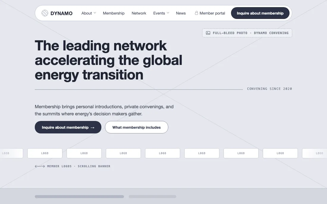 Plan · our wireframeOne-line promise, up top“Inquire about membership” in the menuMember logos as proof
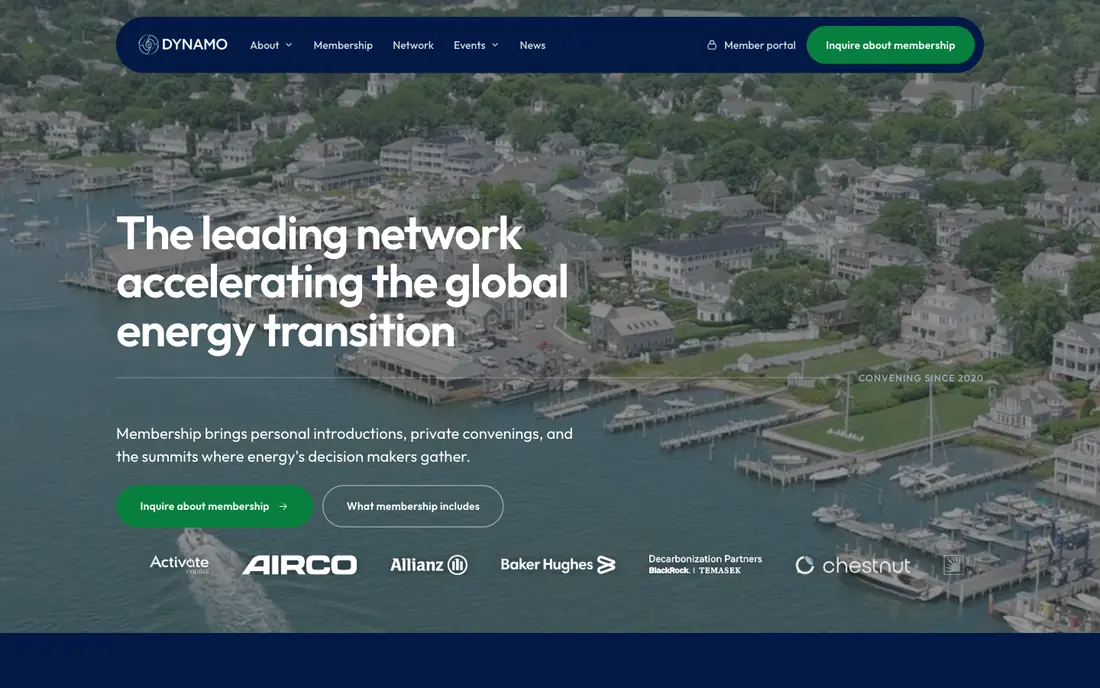 Live todaySays what Dynamo is, in one lineOne clear next step: enquireWho’s in the network, straight away
BeforeA mock-up of the old approach. It opened with a co-working hub, and gave members no clear way in.
Alex has been easy to deal with throughout. He’s happy to answer questions, explains things clearly and has been really helpful whenever we’ve needed anything.
Want the same for your site? We’ll design your homepage first, free. Then you decide.
The plan
First we learn about your business. Then we plan each page. You see how your homepage will look before you spend a penny.
We find out what the people you want to reach need to see, and what stops them getting in touch today.
Simple wireframes for each key page, with your real words and photos, so we agree what goes where before any colour goes in.
Your colours, fonts and buttons go into one design kit. Then every key page gets a finished design for desktop, tablet and phone. You can click through it like a real site.
Want to see your new site first? We’ll design your homepage for free.
Process
A page isn’t designed in one go. It’s built up in layers, and each layer answers one question. Then the whole page is re-made for each screen, not just shrunk.
Keep scrolling — the strip moves sidewaysPlain boxes and grey lines. No colour yet.
We agree what matters most on the page before anything else.
Everything snaps to a 12-column grid.
Even gaps make the page feel calm and easy to scan.
Real words replace the grey lines.
Spaced capitals give it the feel of a gallery, not a shop.
Gallery gold and soft greys go in.
Gold marks the links and buttons, so people know where to click.
The showroom and the pieces go in.
The pieces show what the gallery sells before anyone reads a word.
Hairline borders, thin gold edges, small icons.
Now it’s ready to show you, and then to build.
Screen width1200px
Pairs well with
A great design needs to be built well, filled with the right words and looked after once it’s live.
Website development
Built to match the design exactly, and easy for your team to update.
Content strategy
Plan and write pages that build trust before the first call.
Hosting & care
Hosting, backups, updates and small changes. Most changes go live the same day.
Not sure what you need? Tell us your goals. We’ll suggest the one thing worth doing first.
FAQ
These are the doubts we hear most, with straight answers. Can’t see yours? Ask us on a call.
Your website is often the first thing a buyer sees. If it looks dated or confusing, good leads go elsewhere and you never hear about them. You get a fixed, written quote before we start. And you see your homepage design first, free.
Maybe not. On the first call we’ll tell you straight. Sometimes fixing a few pages does the job. If so, we’ll say so, and point you to conversion rate optimisation instead.
That often happens when a redesign changes the look but not the plan. We start with what each page must do and who it’s for, and agree that in wireframes before any colour goes in. So the new site works better, not just looks newer.
You can, and a template is a fair place to start. But templates are made for everyone, so they rarely fit your buyers, your services or your words. We design around your business, and you keep a design kit so new pages always match.
You see your homepage before you pay anything. If it’s not for you, you walk away and owe nothing. After that, you get two rounds of changes at every step. Most people are happy after the first round, because we agree the plan before we design.
No. Once the final payment is made, every file is yours, including your design kit. Any good developer can build from it. We’re happy to build it too, but you don’t have to use us.
About four weeks from the first workshop. Bigger sites can take a little longer. We agree the dates at the start, so you always know what’s next.
About an hour a week. You join the workshop, look at the designs and tell us what you think. Your logo, photos and words help, but we can start without them.
Yes. We design every key page for phones, tablets and big screens. We don’t just shrink the desktop version. We decide what matters most on each screen.
Yes. Our website development service turns the design into a fast, working site. Or we hand the files to your own developer, with clear notes.
Start here
A short form or a 30-minute call. Whatever suits you.
A real design, ready in about a week. You pay nothing yet.
Love it? We carry on with a fixed price. Not for you? You owe nothing.